

Interaction Designer · Selected by Core Engineering for the ground-up redesign · Field research · IA · coded prototyping
The redesign gave coordinators task-based navigation, multi-student actions, and a way to carry selected students through related testing tasks without starting over.
District test coordinators often had about two weeks to prepare and run high-stakes testing. The product also had to handle different state rules, staffing models, and accessibility needs.
Field studies showed coordinators quickly understood how the new model could save time and reduce stress during testing. The coded prototype gave Product and Engineering a working reference for implementation.
District test coordinators often had about two weeks to get an entire district ready for testing. Too much of the work in PearsonAccess still happened one student and one action at a time.
That became especially demanding when coordinators needed to prepare groups, move students between sessions, handle transfers, order materials, or make the same change across many records.
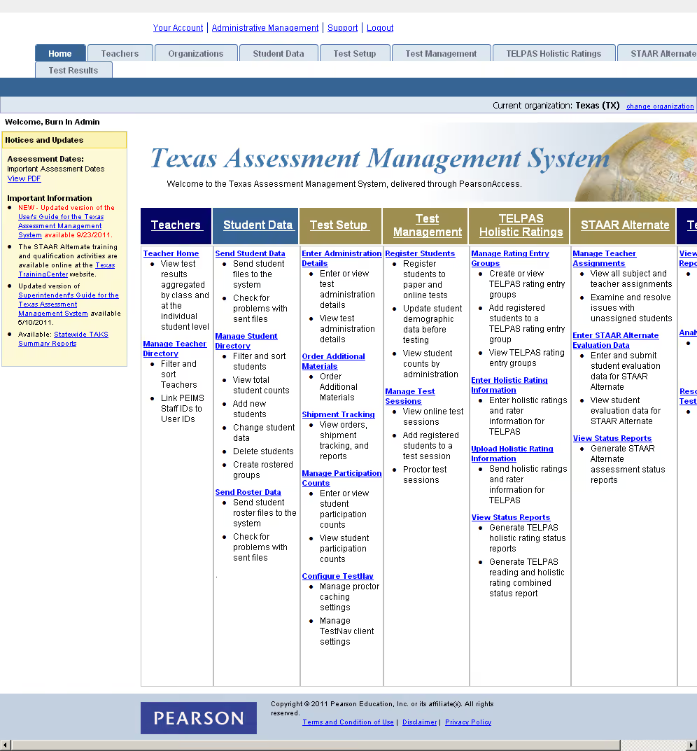
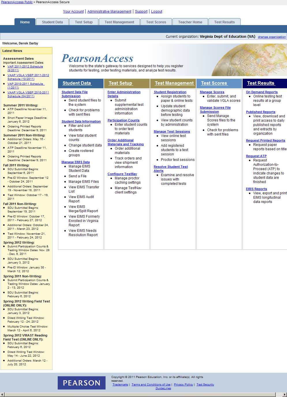
PearsonAccess exposed a dense, system-oriented structure before coordinators could get to the task they needed to complete.
- Core workflow challenge: Navigation and task structure reflected Pearson’s system more than coordinator mental models.
- Operational reality: Student records, sessions, users, files, reporting, and exception handling had to work together under time pressure.
- Constraints: State rules, district scale, staffing, roles, and bulk-data practices varied widely.
- Design challenge: Make navigation and decision-making easier while keeping the operational complexity coordinators still needed visible.
PearsonAccess handled student records, test data, sessions, users, organizations, and state-specific administration rules. The interface exposed that structure directly, so routine work often started by figuring out where the right data lived.
The bigger pain surfaced during testing windows. Coordinators often needed to make the same change across a group of students, prepare a session, fix transfers, order materials, or move through several related tasks in sequence.
Too much of that work was linear. They found a student, completed an action, then repeated the process for the next student or the next task.
The Texas home screen surfaced system structure, alerts, and administration controls before coordinators reached the work they needed to complete.
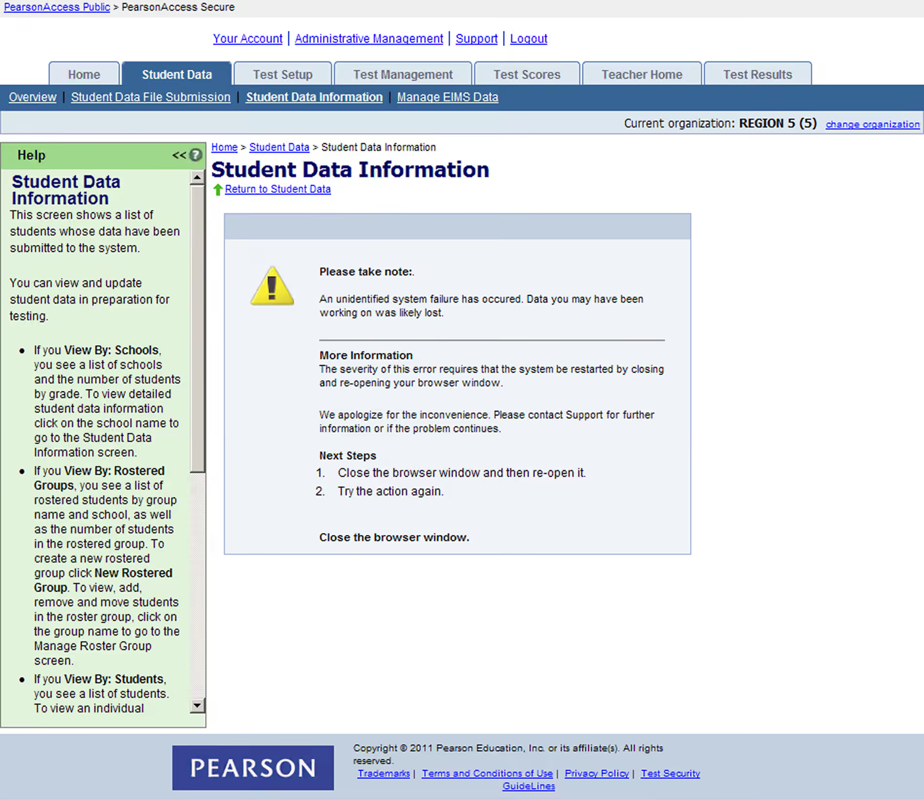
One recovery state required a coordinator to close the browser and start over. During test administration, the redesign offered an opportunity to make recovery much more direct.
Cleaner navigation was only part of the answer. We also needed a way to keep selected students together while the coordinator moved through related work.
State and district differences still had to fit within one product, with contractual variation handled through configuration and shared patterns.
That made the redesign as much about the interaction model as the navigation.
PearsonAccess served organizations with dramatically different scale and ways of working. A small district might have one person doing nearly everything; a large district could distribute work across many coordinators, schools, and support roles.
The redesign had to support:
- Common interaction patterns with state-specific requirements
- Single-record work with bulk uploads and multi-record actions
- Simple day-to-day tasks with high-stakes exception handling
- A more intuitive model with the realities of existing data and implementation constraints
The interface needed to be easier to use while still supporting all of that operational variation. Business goals for the redesign included a 25% increase in user satisfaction and 30% revenue growth through retention and new contract wins.
I started with Pearson’s state-program SMEs and coordinator surveys, then built an initial prototype and took it into field studies in Texas and Virginia.
The field work showed how much the job changed with staffing, delegation, state policy, technology, and the way each district organized the work.
- Texas field study · five districts, from about 129 to more than 204,000 students
- Virginia field study · five divisions, from about 750 to nearly 67,000 students
- Current product + prototype evaluated against real administration tasks
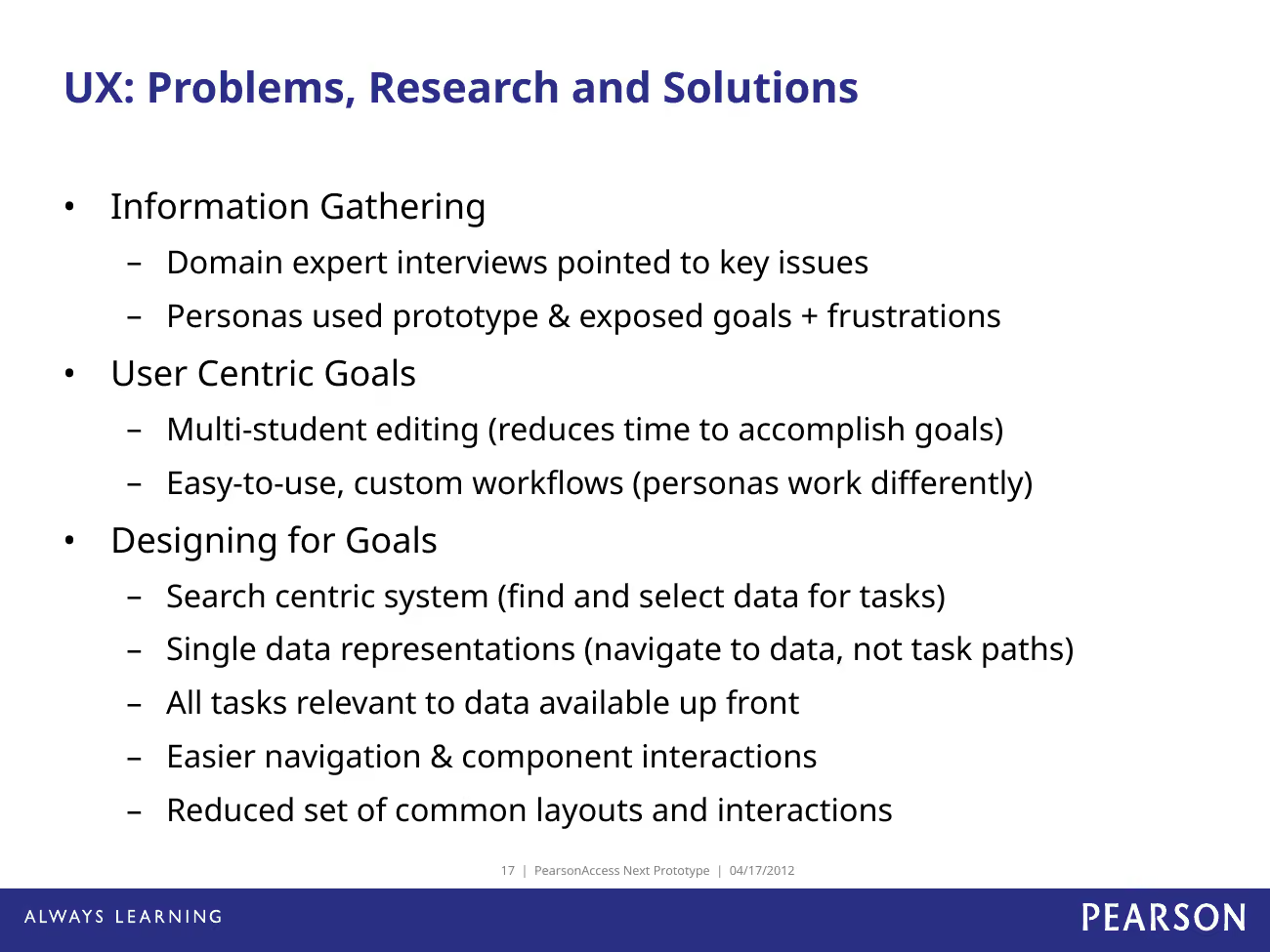
Field research and domain interviews gave us four concrete design goals: support multi-record work, flexible workflows, search-centered navigation, and a smaller set of reusable interactions.


The personas made the operating differences concrete. Colby represented a smaller Texas district where one coordinator carried most of the testing work. Julia represented a more team-based, data-heavy district. Barb represented a larger Virginia division where coordinators needed to work across multiple students and related tasks.
That range helped us see where the product needed flexibility. The same testing task could be handled by one person in one district and split across several people in another, while the underlying workflow still needed to feel familiar.
Colby represented a smaller Texas district where one coordinator handled most testing work directly in the UI.
Julia represented a more team-based Texas district with heavier data work, delegation, and faster movement across tasks.
Barb represented a larger Virginia division where coordinators needed to manage multiple students across related tasks and custom workflows.
I started with Pearson’s state-program SMEs and coordinator surveys to map policies, recurring tasks, edge cases, technology comfort, and workarounds. That gave me enough to build the first prototype. Then I took it into field studies in Texas and Virginia, where we watched coordinators work through real scenarios and compared the prototype with the current system.
- District size changed who performed work, how responsibilities were delegated, and how much bulk processing mattered.
- Common workflows were recognizable across sites, but state and local rules created meaningful variation.
- The next-generation prototype generally matched common scenarios and was consistently perceived as simpler than the current product.
The field work showed two things that shaped the redesign: coordinators needed to work across multiple students at once, and the same job looked very different depending on staffing, delegation, state policy, and technology.
The research produced four primary district and division coordinator personas plus two supporting role archetypes. The useful differences were staffing and delegation, state rules, technology comfort, file-heavy versus UI-heavy work, and how much support each coordinator had.
The same task could be a one-person job in one district and split across several people in another. The personas helped us decide which differences needed product flexibility and which could share the same interaction.
The interaction model let coordinators find the students or sessions they needed, select one or many records, and keep working from that context.
Personas and use cases helped us decide which differences needed product flexibility and which could share the same patterns.
For related tasks, coordinators could carry the selected students forward and avoid searching for the same records again.
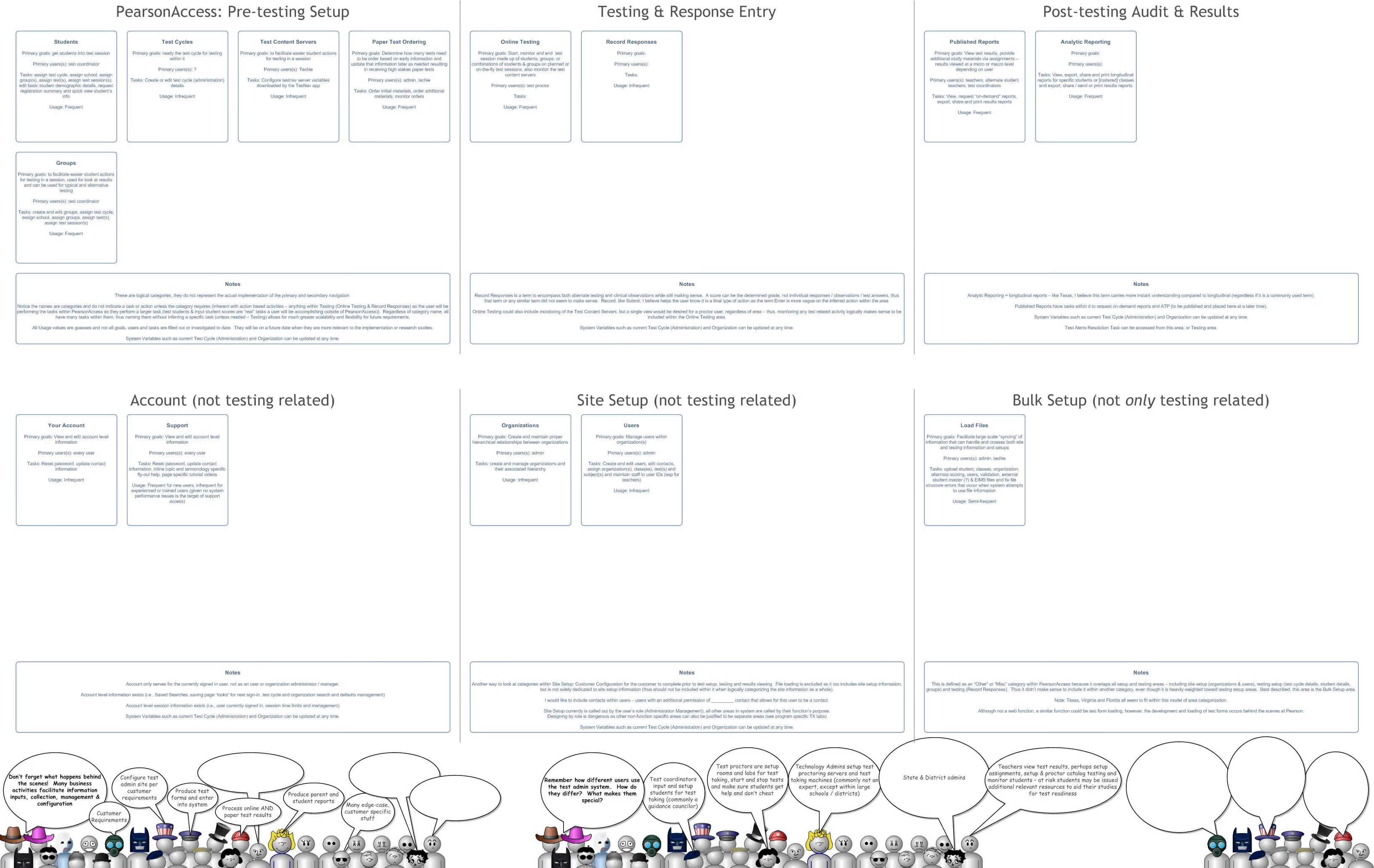
The navigation and data views gave coordinators stable places to find records, take action, and move into related testing work.
Field research gave the interaction model a simple rule: coordinators should be able to find the students or sessions they needed, select the records involved, and keep working from that context.
I used the content inventory, navigation work, personas, and use cases to define a smaller set of stable places in the product: students, groups, sessions, users, organizations, and test setup.
The navigation grouped work around the tasks coordinators came to complete. The data views became the place to select records and act on them.
- Goal: Make the right data and actions easy to find through coordinator tasks and language.
- Inputs: Student, organization, test, session, user, and reporting data; state and role context.
- Core interactions: Search, filter, select, edit, assign, upload, monitor, resolve, and report.
- Rules: Collect like information and tasks together; avoid multiple representations of the same data.
- Scale challenge: Keep one understandable model while allowing contractual and state requirements to vary.
From a student, group, or session view, coordinators could see status, select multiple records, apply actions in bulk, and continue into the next related task.
For work that naturally came as a sequence, the selected students could carry forward into related tasks, such as building groups and preparing test sessions.
- Orient coordinators with dashboard and status summaries, then organize navigation around their mental models and common task groupings
- Provide a single, consistent representation of each data type
- Make high-frequency actions available where users were already working
- Support bulk and single-record work with the same underlying patterns
- Keep state-specific behavior configurable within one shared product model
That reduced the need to repeatedly search for the same students as the coordinator moved through a testing workflow.
The product needed a shared model that could absorb contractual and state differences across deployments.
We used personas, use cases, and context scenarios to separate true variation from differences that could share the same interaction pattern.
The interaction model had to handle that variation while keeping navigation stable.
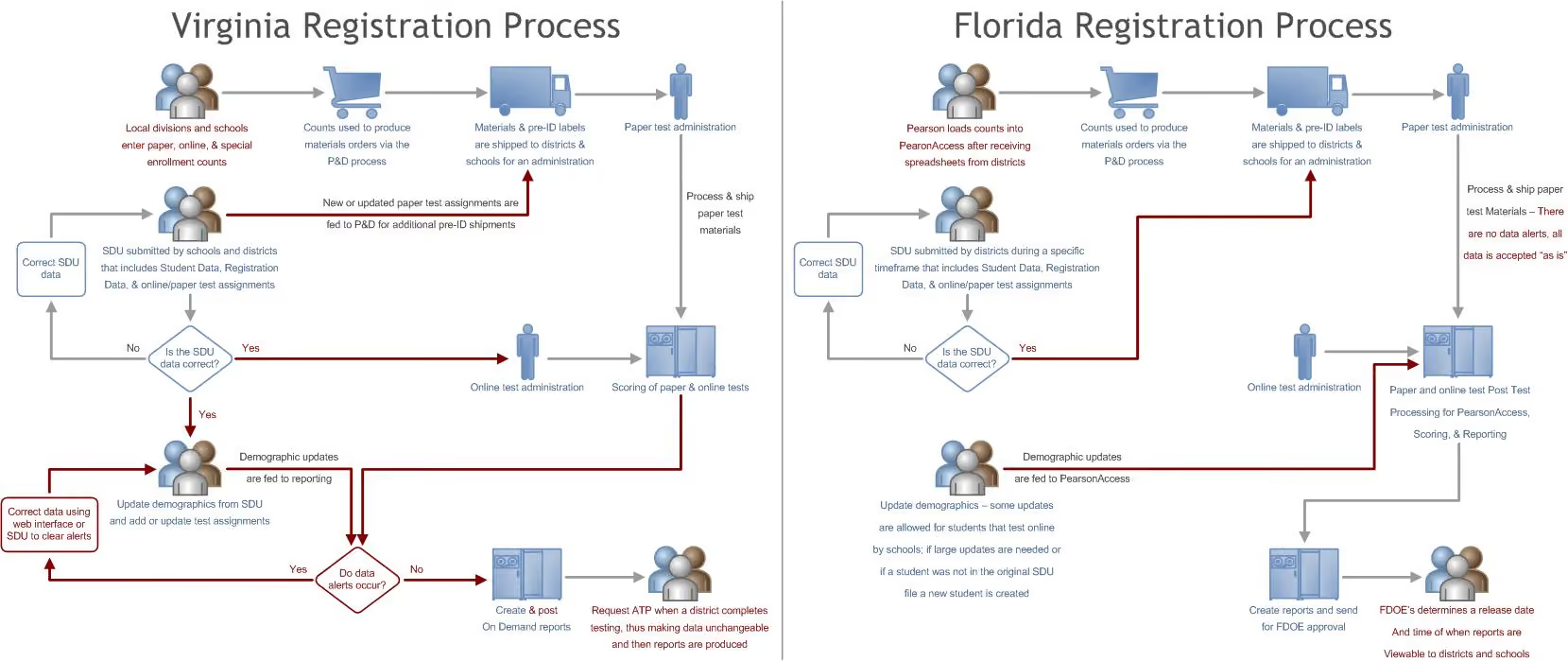
Virginia and Florida registration processes differed enough that the shared model had to support meaningful variation without fragmenting into separate products.
I moved from Balsamiq wireframes into higher-fidelity concepts and a working front-end prototype, using the same interaction model across students, groups, sessions, and administration work.
Search, data grids, multi-record editing, bulk actions, and consistent page patterns made the model concrete enough to test and hand to engineering.
The prototype showed how a small set of predictable interactions could cover a lot of operational work.
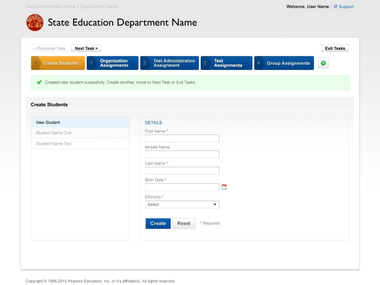
The student workflow showed how the new navigation and data model would work during day-to-day administration.
I started the interaction work in Balsamiq so we could test structure and workflow quickly before spending time on visual polish.
The higher-fidelity prototype then connected students, groups, sessions, users, and organizations through the same interaction model.
The goal was consistency: find the records, select one or many, take an action, and keep enough context to move into the next task.
Core behaviors included:
- Find the right data quickly through search, filtering, and clear navigation
- Use the same interaction model for one record or many
- Keep status, context, and available actions visible together
- Use consistent task patterns across students, groups, sessions, and users
- Surface warnings and exceptions where users could resolve them
Consistency mattered because coordinators often moved rapidly between routine setup and exception handling.
The prototype covered the work coordinators actually had to do, including finding and editing students, creating groups, preparing sessions, monitoring testing, and handling changes across multiple records.
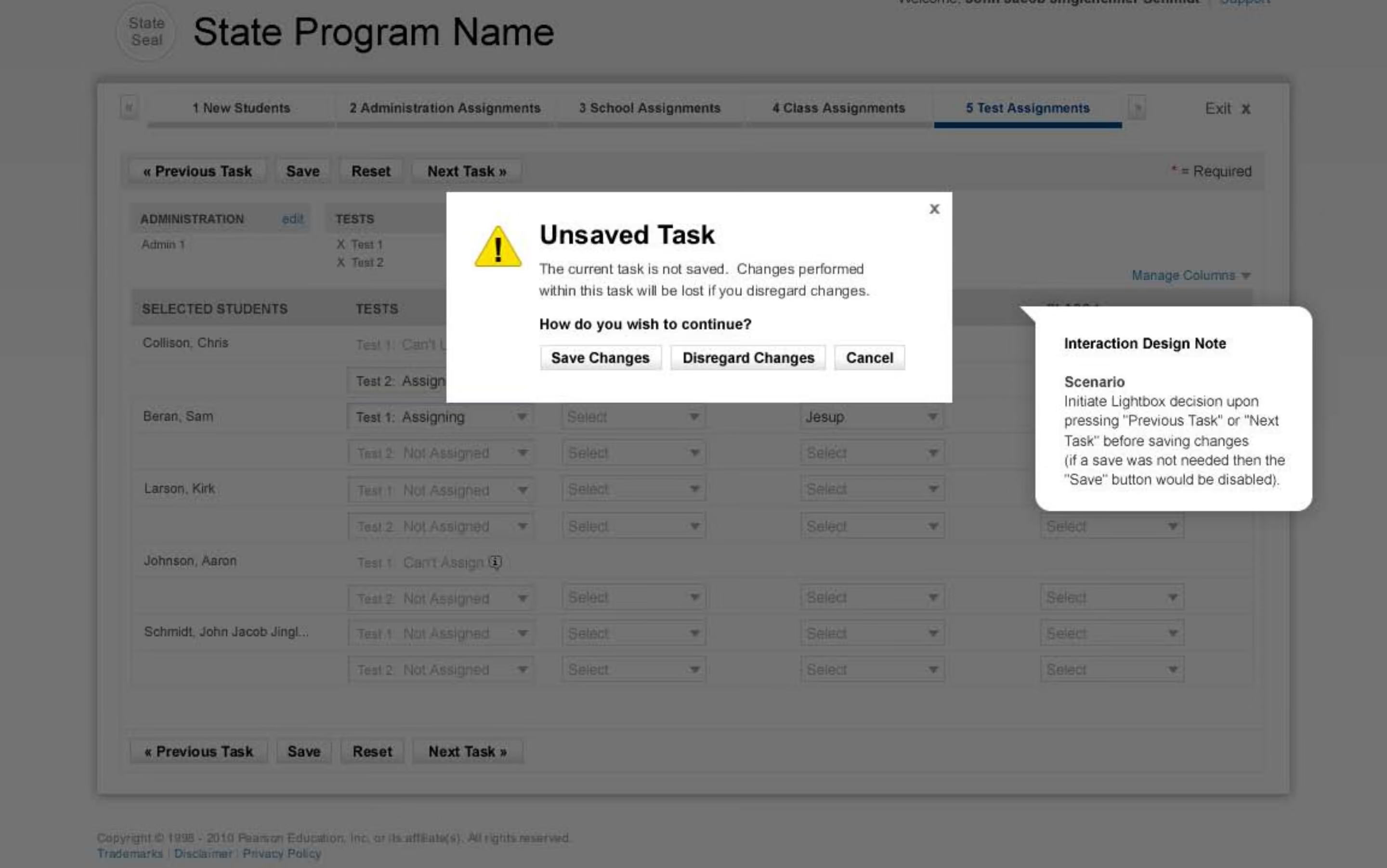
Those scenarios exposed details a simple happy path would miss, including selection state, bulk actions, save behavior, power failures, fire drills, suspected cheating, incomplete student statuses, and recovery when work was interrupted.
Annotated iterations worked through task progression, save behavior, cancellation, and unsaved-work recovery before those patterns were carried into the working prototype.
Once the interaction model was stable enough, I moved it into higher-fidelity visual design and a working front-end prototype.
My earlier Pearson work was hands-on front-end development, so I could work directly with XHTML, CSS, and jQuery and talk through implementation details with engineers. I also ran a full Section 508/WCAG audit, tested with screen readers and text-only browsing, and gave engineering code-level fixes. Accessibility stayed part of implementation quality throughout the redesign.
The work produced:
- A task-oriented navigation model grounded in coordinator mental models
- Reusable patterns for search, filtering, grids, selection, and multi-record tasks
- Concrete workflows for student, session, user, and online-testing administration
- A higher-fidelity visual direction that could be evaluated in context
- A working front-end prototype connecting interaction decisions to implementation
The screens, interaction rules, and working prototype gave Product and Engineering a concrete reference for implementation.
In Texas and Virginia, coordinators worked through common tasks in both the current product and the next-generation prototype.
After using the prototype, coordinators could see how the task-based model could save time and reduce stress during the testing window.
- Prototype generally matched common administration scenarios
- Navigation and task workflows were explicitly tested
- Recommendations captured usability refinements, capability needs, and operational considerations
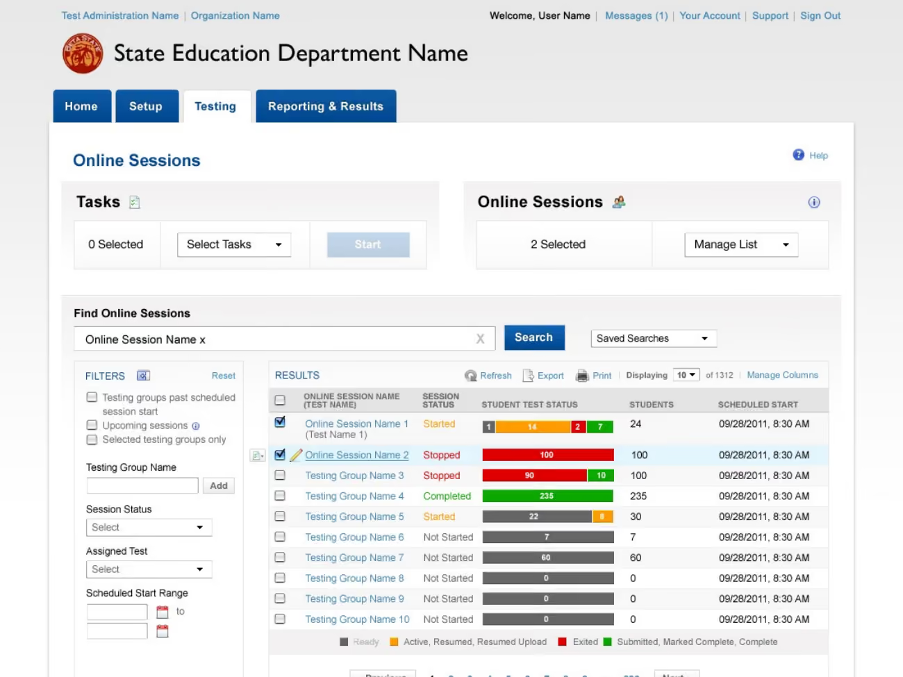
Online-session monitoring was one of the workflows field studies helped refine, including status visibility, student counts, and recovery needs during active testing.
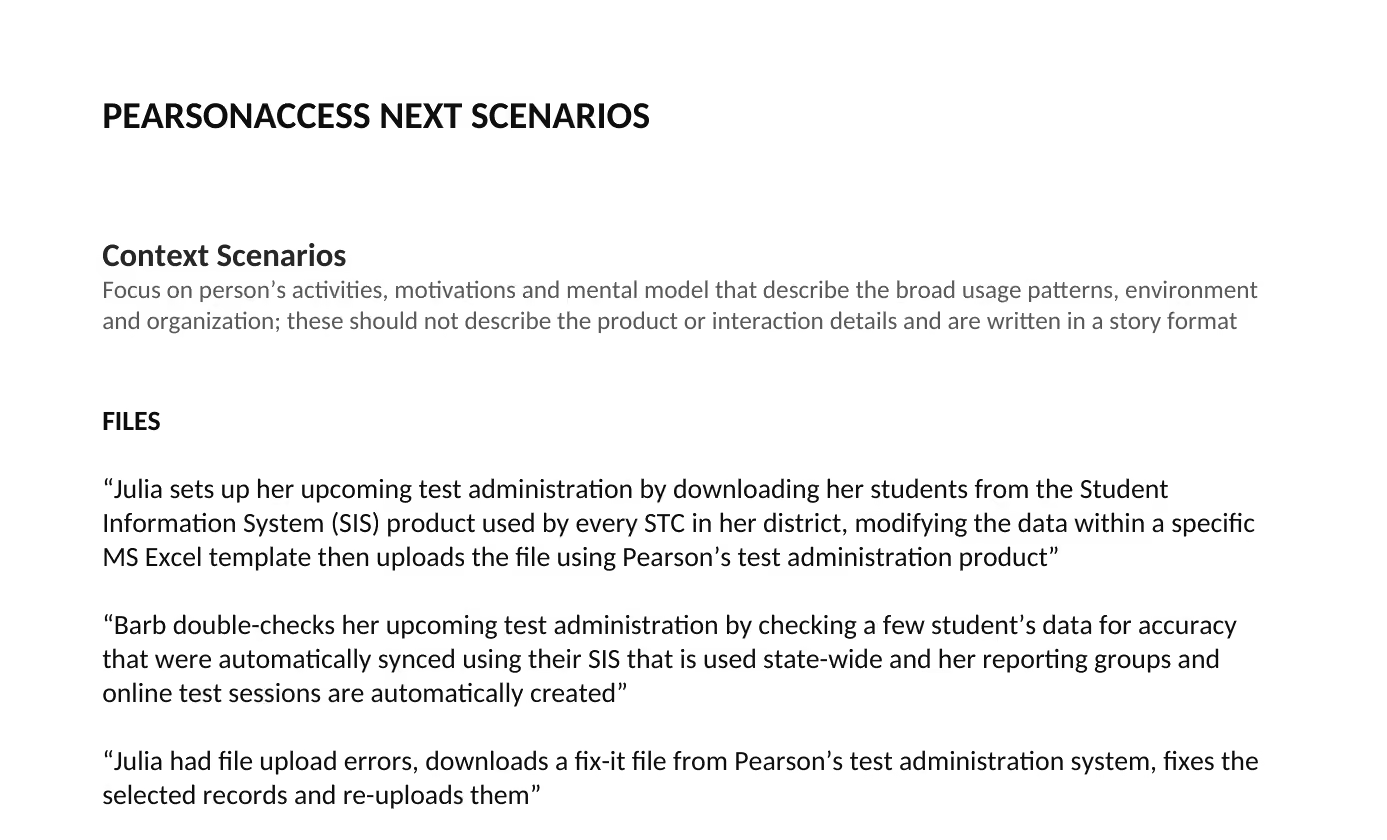
Validation happened in the same Texas and Virginia field studies. Coordinators worked through common scenarios in the current system and the prototype, and we asked where the new model matched or broke from their real work.
Once coordinators started working through realistic scenarios, the task-based model made sense quickly.
They could see how multi-student actions, clearer navigation, and carrying context across related tasks could save time during the testing window.
The feedback was positive, and the sessions sharpened the workflow before implementation.
- Texas participants described the prototype as “intuitive,” “so easy to use,” and “10 times better” than the current product.
- Virginia participants described the direction as “clean and uncluttered” and responded positively to the streamlined interaction model.
- The prototype generally matched regularly performed scenarios across both studies.
- Participants still identified missing filters, data details, session behaviors, warnings, and state-specific needs.
That gave us something useful to take back into the Agile team: a direction people understood, plus specific interaction details to refine before implementation.
The studies turned broad design principles into a prioritized refinement backlog.
They helped us:
- Confirm task-oriented navigation was understandable to both frequent and less-frequent users
- Refine search, filters, IDs, counts, and multi-record actions around real coordinator needs
- Strengthen online-session monitoring and recovery patterns
- Separate universal workflow needs from state-specific requirements
- Carry field evidence directly into subsequent prototype iterations
Validation strengthened the core model and clarified the highest-value refinements before implementation.
Online-session monitoring was one of the workflows field studies helped refine, including status visibility, student counts, and recovery needs during active testing.
The field studies gave us confidence in the interaction model and sharpened the workflow before implementation.
PearsonAccess Next had a clearer model for task-based navigation, multi-student actions, related workflows, and state and district variation.
I carried the same lesson into later EdTech work: map how the work actually gets done first, especially when software serves different roles and local rules.
- Field research validated the next-generation direction across two states
- Personas, use cases, and navigation work gave Product and Engineering concrete reference points across different coordinator contexts
- Use cases and validation scenarios captured non-happy-path behavior
- High-fidelity and coded prototypes linked interaction design to implementation
Building reusable patterns before modern design systems
PearsonAccess Next came before modern design-system workflows were standard. Implemented styles lived with Engineering, so I supported a coherent experience through detailed interaction specifications, reusable pattern guidance, and close collaboration with the engineers building the product.
We created detailed style guidance to keep those decisions consistent across the application. My earlier front-end development experience helped me work comfortably at the implementation level: I had built production UI in HTML, CSS, and JavaScript before moving fully into interaction design, and later provided code-level recommendations during the platform's accessibility audit.
Today I'd formalize that same intent as a shared design system with reusable components, documented interaction states, accessibility requirements, and a tighter connection between design decisions and production implementation.
How I'd approach this work with AI today
PearsonAccess Next started with field research in 10 districts across Texas and Virginia. We watched how the work actually happened, which led to a six-role coordinator model and task-based navigation.
Today I'd use AI to help sort through the interview and observation notes across those roles. I'd look for repeated workflow patterns, meaningful differences between coordinator needs, and questions worth taking back to the research. Then I'd use it to sketch alternative task flows and navigation structures and explore how well they hold up across different district sizes, responsibilities and workflows.
Field research would remain the source of truth for the important decisions. AI would help me see patterns and explore possibilities faster, with the direction grounded in what we actually learned from coordinators.
1. Design around the unit of work. Coordinators rarely worked one student and one task at a time. During a testing window, they moved across groups of students and clusters of related tasks.
2. “Edge cases” are often the real product. In high-stakes administration, transfers, mismatches, warnings, resumptions, bulk changes, and time-sensitive recovery are normal operating work.
3. Scale changes workflow. Small and large districts may use the same data, but staffing, delegation, batching, and checkpoints can be completely different.
4. Prototypes are most useful when they carry the model. The coded prototype let research, navigation rules, interaction patterns, and implementation constraints meet in something people could actually test.
5. Let people experience the model. Coordinators who were hesitant about another system change quickly saw the value once they could work through realistic scenarios in the prototype.
6. Build influence through evidence and partnership. Research, visible product improvements, and direct collaboration with engineering gave the redesign momentum across the team.